Section Head of Graduates, holding a Hero Panel with Hero Head, Hero Par and a Btn. Duplicate the section class before changing the background — it is shared, so the image changes on every page using it. Hero Panel is 30 percent wide; the wide combo takes it to 35.
BtnThe same hero with a Right combo on the section, which moves the panel to the other side. Everything inside is unchanged — only the section's justify-content flips.
BtnSec is the band: 50px top and bottom, plus Teal or Grey. Inner is the content column inside it: 1296px max, 100px inset, 20px gap, 25px inset at 479px.
Paragraph Primary
Two bands always sit 100px apart. That reads right when the colour changes and reads as double when it does not — so the lower band of a same-colour pair takes touching, which zeroes its top padding. The band below has it.
A List with Bullets on the ul, Bullet on each item, and a plain Par inside it. Bullets sets the 22px indent and the marker colour; Bullet the 8px between items. On a teal band use Bullets + On Teal and Par + On Teal, or the markers stay teal on teal.
Want to feel confident and prepared when you join the workforce
Want to try and build a start-up of your own
Want to learn more about business and entrepreneurship
Want to develop skills that are valued by employers worldwide
Want to improve your CV or student profile for further education
White below white, so this band carries touching. Watch out: a hidden section does not render, so a band can end up touching one two places away in the Navigator.
Use combo class touching to remove upper padding, which makes sections look more coherent
Par + Primary — one emphasised line, not a paragraph.
Par + On Teal — body text on teal. Forget the combo and the text stays teal on teal.
Note + On Teal — 12px footnote.
Icon row, no box. Each cell is a Bar Item. On a white band the label needs Bar Par + Dark. Never put an icon row inside a Bar — Stats is the boxless version.




Badges alternate Circle + Teal and Circle + Primary. On a teal badge add Circle Icon + Light to flip the icon white. Two Up makes the row 2x2 at 479px instead of one stack.
Four-column grid, 30px gap. Card = Card Img + Card Par + Card Head. Card Img is fixed at 200px, which keeps every card the same height. On teal add On Teal and Primary. Watch out: Cards has a 10px bottom margin, so a section ending in one sits 110px from the next, not 100px.
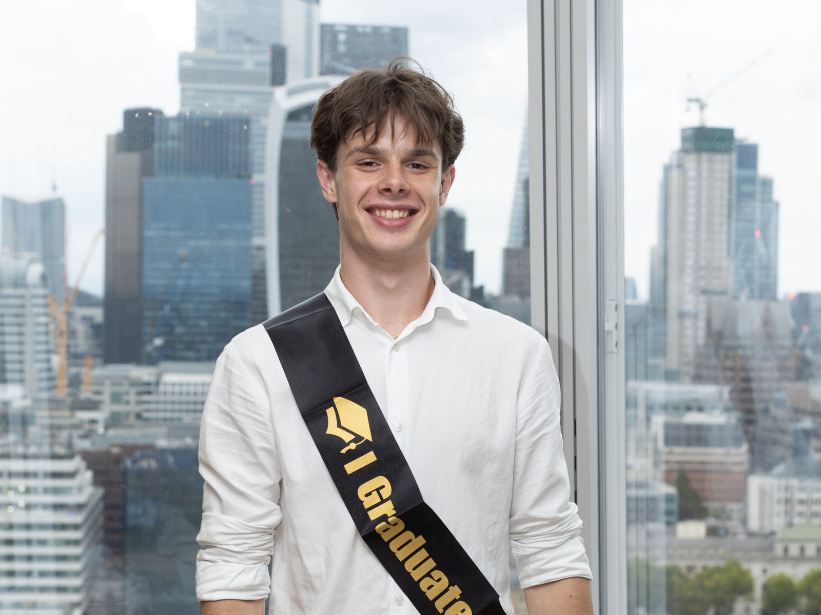
I took on real projects, pilots and partnerships. And eventually, thanks to recommendations and my involvement in Svitlo Graduates, I became a business automation specialist.
.png)
Svitlo Graduates gave me far more than career tools, new connections or even an incredible trip to London. It gave me belief in myself. When I look at myself now I can see how much I've grown
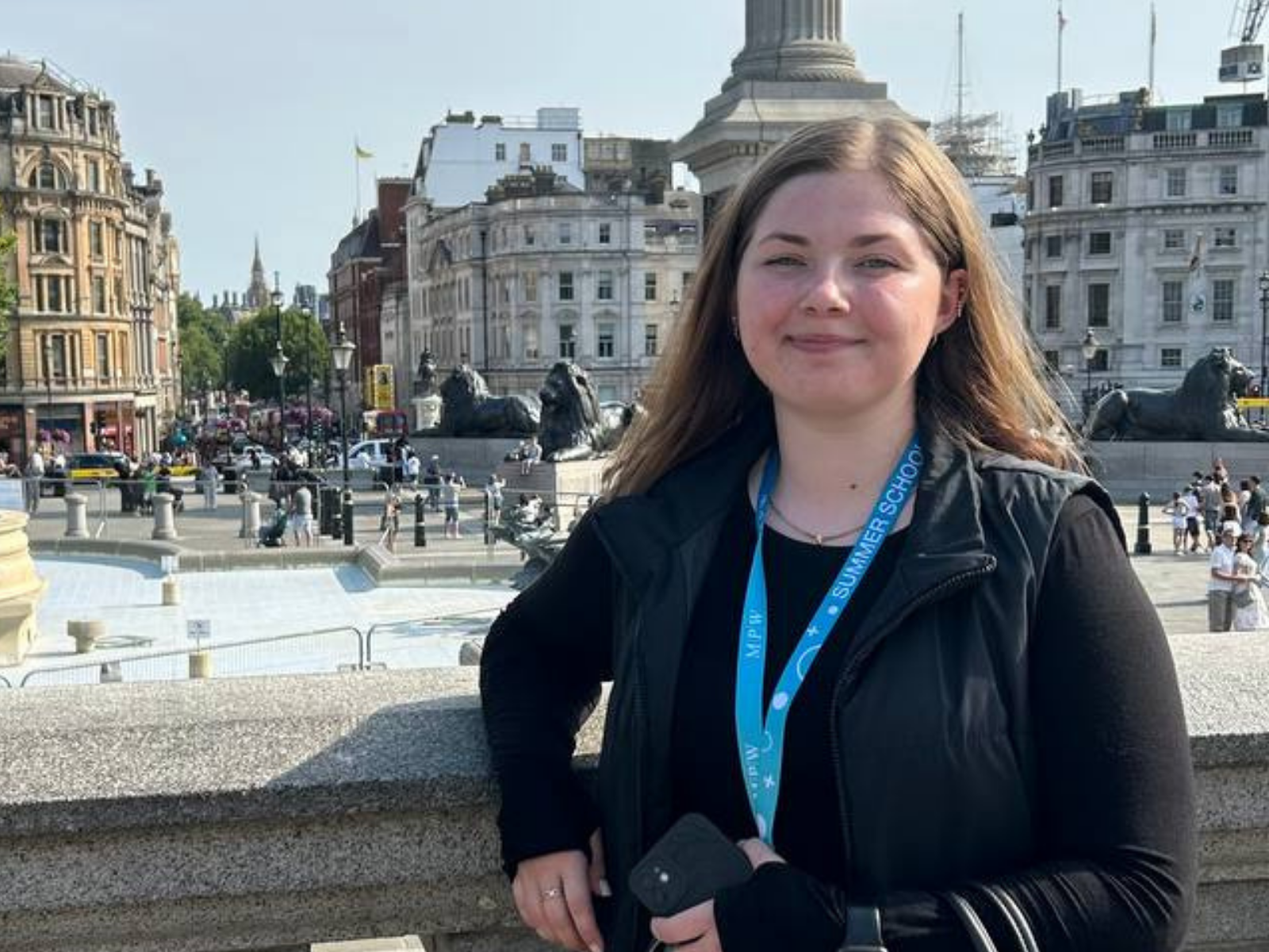
I was pleasantly surprised by just how many meetings there were. The most useful part for me was setting up my own LinkedIn.
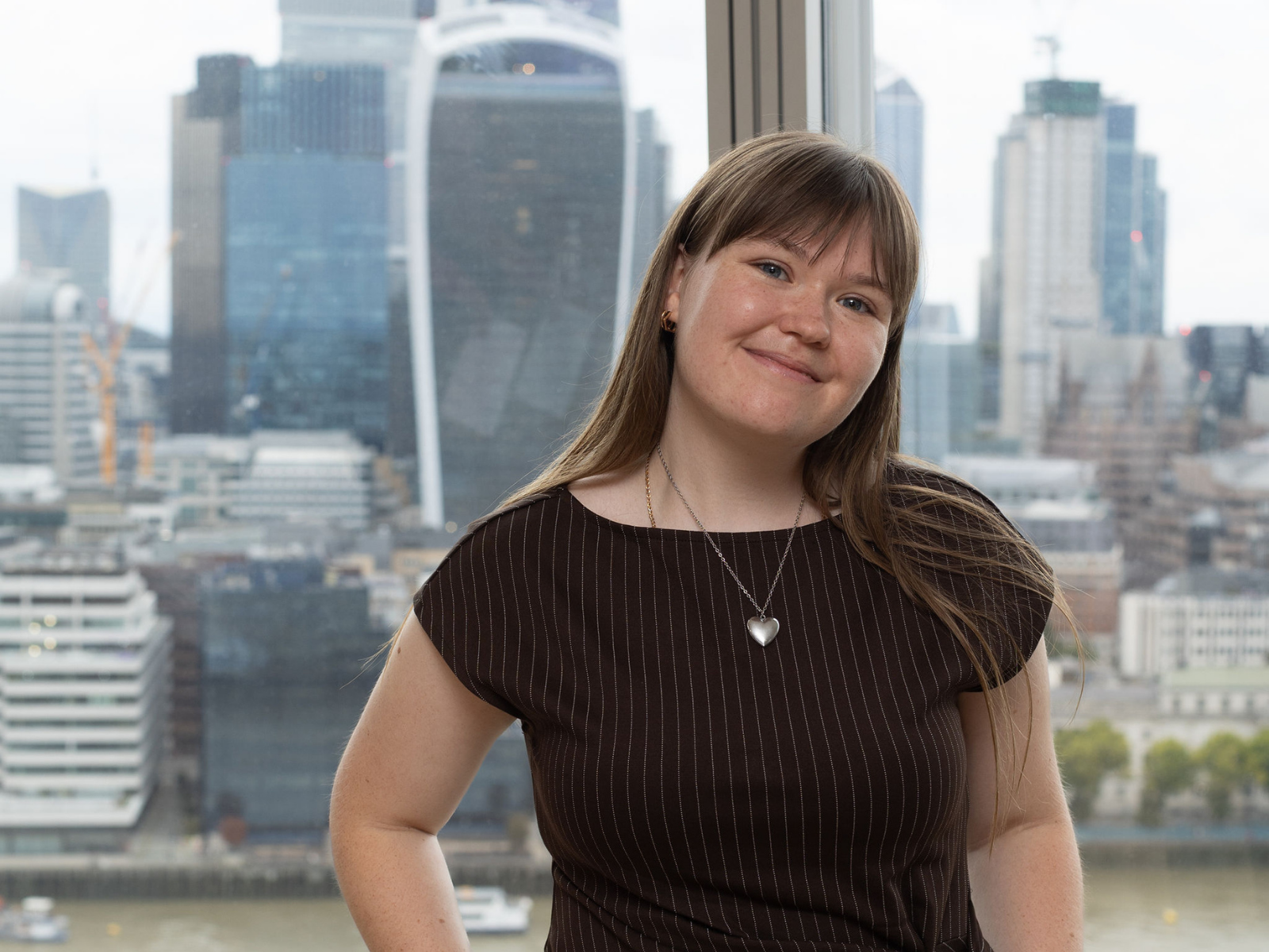
What I love most is the sense of community and the career talks with all kinds of speakers, who broaden your horizons and show you just how many opportunities are out there.
Flex row instead of the 4-column grid, so any number of items share one row. Two columns at 479px. The children here are Bar Items, not Cards.







Manrope throughout. Teal #0A3A40, gold #E6A831, white-smoke #F2F2F2. Every text class carries zero margin — Inner's 20px gap does the spacing.
Par — 16 / 27.2, weight 400. One Par per section with line breaks inside it, never two Par elements in a row.
Note — 12 / 19, centred.
“Quote Mark is a floated gold opening quote, 80px, living inside the first line of a Par. It is a span, not a block — put it as the first thing inside the paragraph and let the text wrap around it, the way this one does.
Wide Left is 1.4fr / 1fr: the text sits in the wide column and the image goes on the right. justify-items end pushes the picture to the right edge of its cell. The image is Img Big with bttm shifted, which pins the crop to the top of the photo when a head would otherwise be cut off.
Wide Right is the mirror: 1fr / 1.4fr, with the image first in the Navigator so it lands on the left. Same 60px gap, same single column at 479px. Use whichever puts the picture on the side you want — alternating them down a page keeps it from looking like a template.
On Student Application the right column holds a Date Card with the next webinar instead of a photo. It can equally be a Bar, a Video or a single Card — Cols only cares that there are two children. Give the card the Fill combo so it uses the whole column.
Saturday 27 September
18:00 Kyiv, 45 minutes
In English and Ukrainian
For parents and students
Pair adds a 20px gap and lets the buttons wrap. Btn has zero margin, so the row does the positioning.
18 / 25, weight 700, teal. The H3 between a Head and its Par. Never name a class Sub — Webflow reserves it and the class silently fails to attach.
The gold version. Centres itself at 479px.
Three columns. overlapping lifts the button 40px so it sits over the photo. When the fixed 200px crop cuts your subject out, add Card Img + leftshifted or + bttm-shifted rather than changing the height.
Btn is the gold pill, 6px radius, zero margin — the row positions it. Btn + hidden hides a button at 479px only.
Teal rounded box, 15px radius. Each cell is a Bar Item holding a Bar Num and a Bar Par. Stacks to a column at 479px. For the same cells with no box, use Stats.
Bar + Gold. Both text classes then need On Gold or they stay white.
The same Bar with Step Icon and Arrow Icon. The arrow rotates 90 degrees at 479px so it points down once the bar stacks.


Note — 12px footnote. On a teal band it needs On Teal.
Teal card for dates and timetables. Date Head is the gold label, Date Par the line under it. Date Card caps at 400px, so inside a 1fr / 1fr Cols it leaves dead space to its right — that is the left card below, and it is why a two-card row looks unbalanced. Add Fill to make the card fill its column, as the right card does. wide is the middle setting at 450px. The right card also shows Groups and Group for several date pairs: inside a Group the paragraph needs Flush, or Date Par's 16px margin stacks on top of the gap.
Date Head — the gold label
Date Par — 16 / 24, white, with its own 16px bottom margin.
Monday
Date Par + Flush inside a Group
Wednesday
the Group gap does the 4px spacing
Saturday
and Groups puts 20px between the pairs
Img Big is full width, 320px, cover. Card Img is the 200px card version. Both crop with cover — when the crop cuts your subject out use bttm shifted or leftshifted, never a different height. Wrapper here is Cols + separated.
Left: Img Big. Right: the same photo with bttm shifted. Below: Video, an empty 16:9 box — drop an Embed with the iframe inside. vertical narrows it to 75% for a portrait clip.
Scroll-snap track. Advances one card, stops cleanly at the last, takes a touch swipe. Rail holds the arrows, Rail Track scrolls, cards sit in Rail Slide, arrows are Rail Arrow (+ Prev on the left, + Off when you hit an end) with a Chev inside (+ Back on the left). Copy the whole block and change the cards — the script wires itself.
Rail Arrow is a teal circle, which vanishes on a teal band — so here it takes Primary to go gold, and the Chev inside takes Dark to go teal. Prev needs its own Primary (Rail Arrow + Prev + Primary) because the left arrow already carries two classes. On a white band leave all of that off: the plain teal arrows are shown in the next section.
Each slide is one third of the track, minus the 30px gaps. At 479px a slide is the full width.
Card, Subhead + primary, Par + On Teal and Card Img — all the ordinary classes, nothing special inside.
Add or remove slides freely. The arrows work out how far to scroll from the first slide, so nothing needs updating.
The scrollbar is hidden by the script, which injects the one rule the Webflow style panel cannot write.
At the last card the right arrow dims and stops responding — that is Rail Arrow + Off, added by the script.
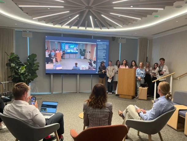
Same block, nothing added. On white the plain Rail Arrow reads fine, so no Primary and no Chev Dark. Text inside the cards goes back to plain Par rather than Par + On Teal.
Three slides here instead of five — the arrows work out the distance from the first slide, so the count does not matter.
Two Rails on one page is fine. The script wires each one to its own arrows.
At the last card the right arrow dims — Rail Arrow + Off, added by the script.
At the last card the right arrow dims — Rail Arrow + Off, added by the script.
Never edit one of these classes to fix one page — every page shares them. Add a combo on top and style that. touching, Flush, Dark, spread and wide all came from this.
Give every new combo its own 479px rule if it changes width, display or direction. A combo with no mobile rule beats the base class's mobile rule.
Everything above is the parts catalogue. Everything below is the gallery: whole sections, already assembled. Copy one, swap the text and the image, done.
Two or three sentences of context, then the icon row, then the rest of the copy if there is more to say. Split the text around the icons rather than running it all before them.
The second half of the copy sits under the icon row. Keep both halves short enough that the row does not float in the middle of a wall of text.
One line introducing the four cards below.
Two lines at most. The image is fixed at 200px, so every card lines up whatever the text length.
Swap the photo and the two lines and the card is done.
Drop a card to get three, add one to get five — the grid is four across, then wraps.
Use Three Up if you want exactly three on a row.
The wide column takes the prose. Keep it to one Par with line breaks inside rather than two Par elements, or the paragraphs end up as far apart as the heading is from the text.
Meet the team“A quote runs three or four lines. The Quote Mark span opens it and the text wraps around the gold mark.
“Keep the three quotes roughly the same length or the cards sit at different heights.
“Add a Card Img above the quote if you have portraits; leave it out if you do not.
Add a Card Img above the quote and the card becomes a testimonial. Card Img is fixed at 200px with cover, so the three portraits line up whatever their original crop — use leftshifted or bttm-shifted on any one that cuts a face off.

“A quote of three or four lines, opened by the Quote Mark span the same way as the version without photographs.
“This one carries Card Img + bttm-shifted, which pins the crop to the top so the face survives the 200px box.
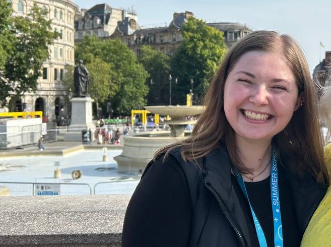
“Keep the three quotes roughly the same length, or the cards finish at different heights.
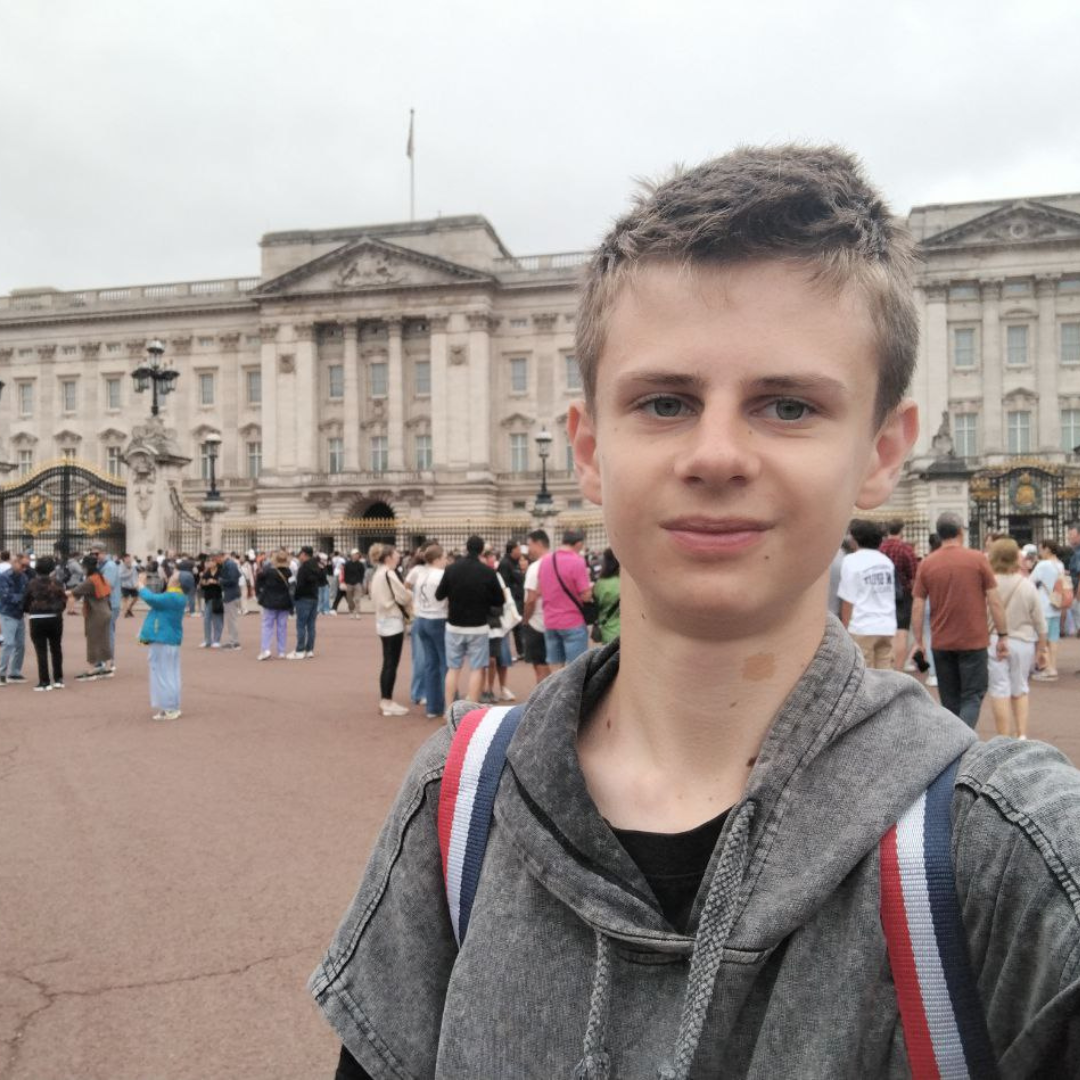
“Thank you for the space you have created to help my son form his own personality. To this day he goes to lessons with a real appetite for them. And that moment of realising ‘I can. I am capable. The whole world is in front of me’ — how important it is for a childhood to have moments like that.
I feel keenly how much children need an environment for growth and learning today, and need to be shown that the world is big, that there are many opportunities, and that the future is not limited by the circumstances of the present.
Nadia, mother of Gordiy, 16, a Svitlo student since 2023
One line, then the two cards.
Tuesday, 15:00 Kyiv
Ninety minutes, live
Thursday, 15:00 Kyiv
Ninety minutes, live
Monday, 17:00 Kyiv
Two hours, live
Saturday, 11:00 Kyiv
Workshop, optional
Text on the left, video on the right. Drop an Embed inside the Video box with the YouTube iframe — the box already holds the 16:9 ratio and the 15px radius, so the iframe only needs width and height at 100 percent.
One line, then the buttons. This band is white under a white band, which is why it carries touching.


